10 Barrel Brewing
Case Study 03
Category : Brewery
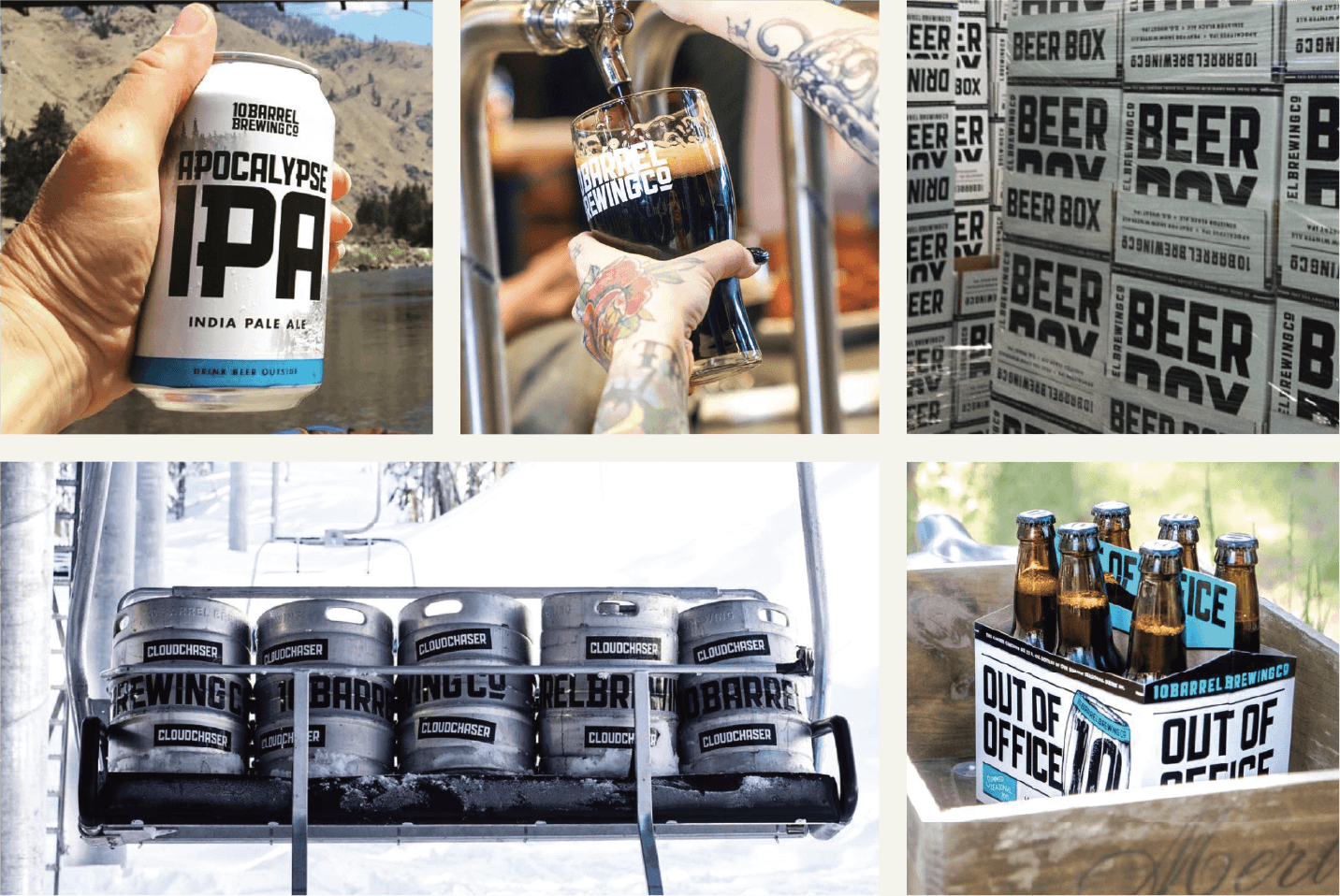
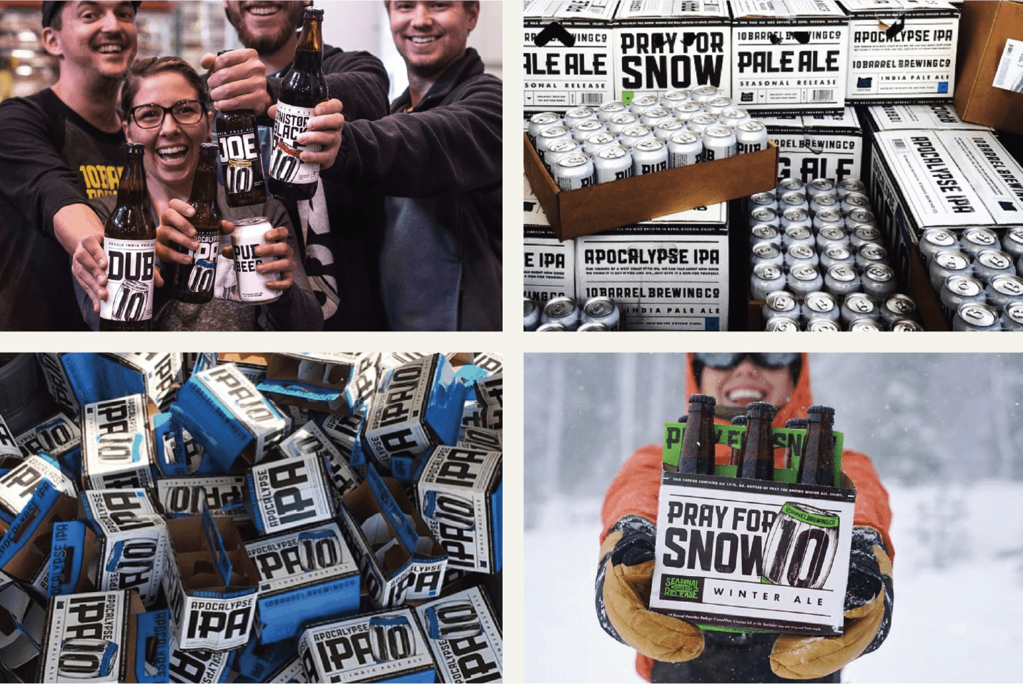
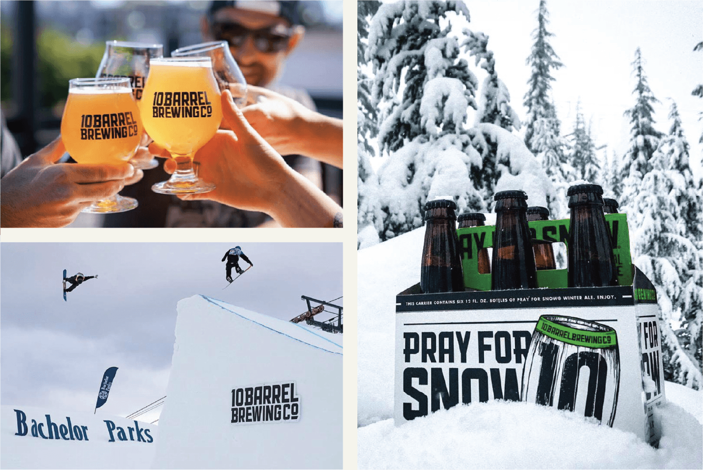
Several years ago a couple of guys who owned a small brewery named Wildfire Brewing came to us with a problem. Due to some legal issues they needed a name change. That’s when 10 Barrel Brewing Co was born. Wilde & Co came in to build the entire identity from the ground up. Naming, logo, tone, packaging, can layouts, bottle designs, seasonal systems, merch direction — if it had a visual touchpoint, we created it.
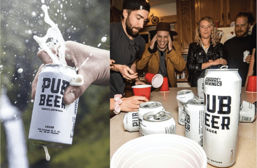
We built a packaging and brand language that was bold, clean, and easy to recognize at a glance. As their lineup grew, the system we created made it simple for them to expand without losing consistency. Every new SKU still felt like 10 Barrel.
That boldness and confidence in the branding ended up being a major part of their trajectory. When Anheuser-Busch acquired 10 Barrel, one of the things they called out was the strength of the visual system — the bold identity, the straightforward messaging, and packaging that popped on the shelf. The brand had a look that could scale, and it became a core asset in their growth.
Today, the identity and packaging system we built still shapes how the brewery shows up in the world.
-
Brand System collection
Comprehensive Brand Guide
Custom typgraphy system
Brand colors
Art Direction across campaigns
Merch ready graphics
Print and POS design for retail environments
Full can and bottle packaging systems
SKU expansion and template creation
Packaging Design for core, seasonal, and limited beers
-
the “10’ Icon.
Wordmark.
the Barrel.


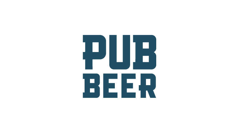
the Pub Beer movement.

10 Barrel Brewing has gone through a few iterations over the years with their branding and packaging. The following examples are a snapshot of the journey we took with them.